Project Brief
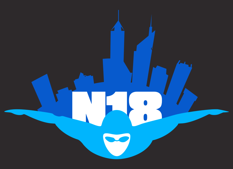
N18 Masters Swimming Australia National Championships in 2018 was commissioning a new logo for their National Championship. N18 was looking for a logo that encompassed an iconic Perth monument, with motion and colours that would be striking for their marketing and merchandising.
The Challenge
N18 Masters Swimming Australia National Championships put out notice for a logo design competition nation wide in early 2018. N18 Masters Swimming Australia National Championships were to choose one logo among the 500 applicants.
The Solution
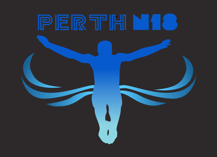
Using the symbolism of Spanda found on Elizabeth Quay I brought together the ideas of ripples, the Swan River, and a swimmer moving through them. The blue colour pallet symbolises the water the swimmers will be in. The simple and striking elements of the logo would make it stand out on all marketing and merchandising solutions. Out of 500 applicants my logo was the one chosen.
Conceptual Design Iterations
The Skills Needed To Produce Brand Excellence
Graphic Design
Illustrations
Design Mockups
Brand Strategy
Final Result & Client Satisfaction
The development of the striking logo by ASB Marketing’s graphic department helped launch our N18 national swim meet and made it an iconic memorable event. The design of the logo along with ASB Marketing’s expertise helped in the development of all our awesome merchandise.


